When searching for a service or a business, customers usually place their priority over a company that owns a website than just a listing. The chances of business getting noticed heighten as 8 out of 10 customers are likely to engage with a business website.
Websites have changed the way consumers look at a business. This helps introduce an edge to the business, establishes credibility, provides multifold exposure, increases sales and conversions. They have massive potential. But that does not necessarily guarantee success and quick conversion.
Your goal for creating a business website shouldn’t only be attracting visitors. It should provide them an incentive to become your potential customers. It’s only a matter of seconds or even less that users evaluate the website – and the first thing they notice is the design.
The design of your website matters as much as your online selling strategy. Apart from being visually attractive, it can also enhance user experience and overall website functionality. The users can interact with the design and stay longer, so to move towards conversion and sales.
If you’re looking for ways to create a business website or want to brush up the old one, here are seven practical ways to make your website more converting and customer-friendly.
1. Keep It Clutter-Free
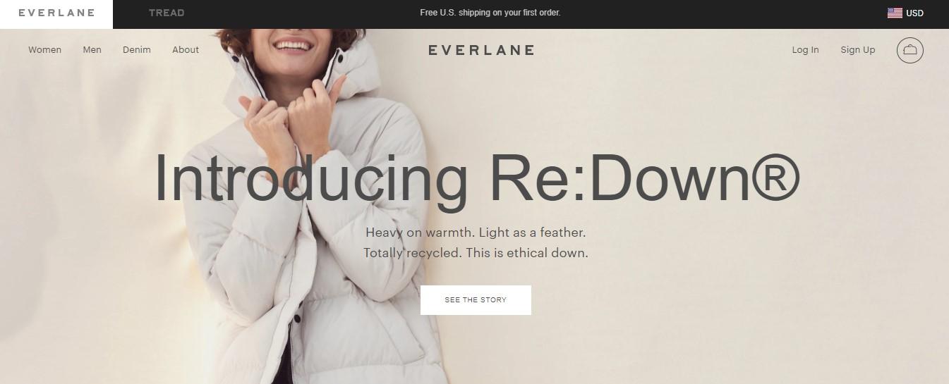
Websites with ample white space project professionalism and are the ones that fetch higher conversion rates. A business website with too much information in a small homepage can retard its purpose; it can repel the visitors instead.
The best practice is to let your homepage breathe with some space, imagery, and a few descriptions. Remove all the unnecessary items and embrace minimalism, which includes everything from your color scheme to the visuals you use. Not only does it look neat, but it also provides a pleasant user experience. While reducing your webpage to the minimum, your intent should be evident from your webpage.
Make sure they find exactly what they’re looking for. You can view other examples of minimalist websites that maximize the value of their text, navigation, CTA, and business intent.
2. Use Responsive Images
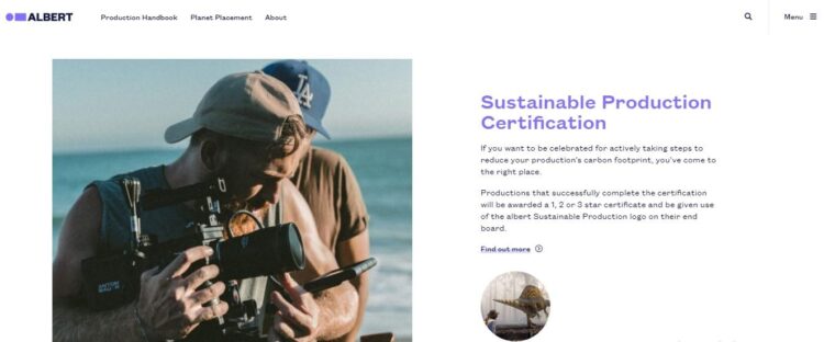
Images are vital. They complement well with other elements of your website. Moreover, these have great potential – from attraction customers to bring them.
Business websites using high-quality, original, and relevant images invite the user to experience the height of professionalism, reliability, and communication. But too many photos can weigh up the page loading speed.
Use few but high-quality images because pages with fewer images have higher conversion rates. You can also use a large hero image, where your icon also serves as a direct call to action (CTA). Also, don’t forget to optimize your images before you upload them; it will save your website loading speed.
3. Run A/B Tests
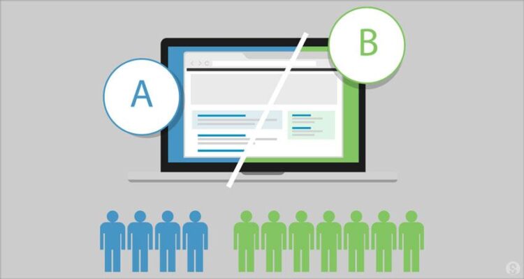
Did you know that colors also influence the conversion rates? Some colors convert better than the others, and this can only be determined by testing different versions of your website. Designing your business website with color variations and adding or removing particular objects can impart a great difference.
A/B testing is where you run alternative versions of one page to record the difference in the conversion of both. 50% of the visitors see one design, while the other half see its variation.
Whenever you’re split testing, don’t change too many elements because you might not be able to notice the details that helped or retard conversion. Go for the most straightforward options, such as colors, CTA buttons, and their placement, etc. You can also test with the current or the control version alongside the changed text. Help yourself improve the way your website appears and leads to conversion.
4. Use Clear Headlines And CTAs
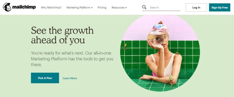
As we’ve repeatedly mentioned CTAs, these are the buttons that invite the user to convert. It’s present everywhere on a website. Headlines and CTAs are the ones that directly provide the motive for the viewer to act even if you haven’t offered any description or information.
You might see various common CTAs like ‘Buy Now, Order Now, Add to Cart, and so on. Notice how they stand apart from all the page’s content and grab the attention with their unique placement and design options.
Whenever you’re choosing headlines and CTAs, make sure you are clear, relevant, precise, concise, and urgent. Your headlines can grab the attention with their short, but big and bold text, while your CTAs can create the urgency and boost the conversion rate up to 332%.
5. Avoid Descriptive Content
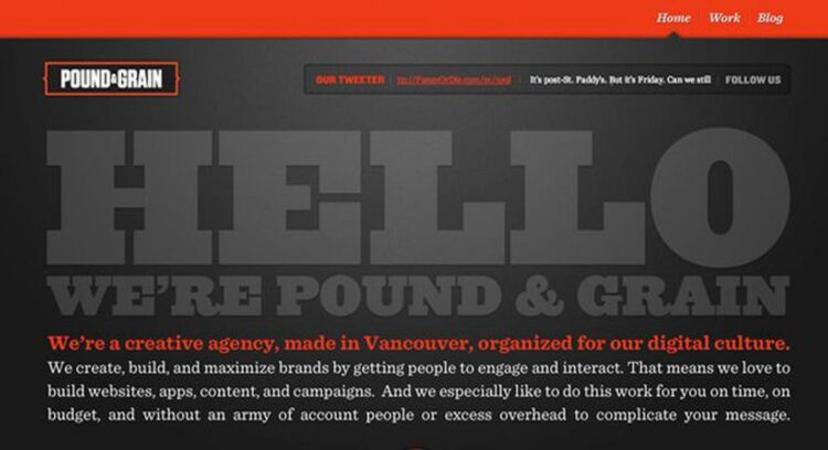
No one likes visiting a website where they are bombarded with product details covering the entire page. While these are vital to stabilizing your customer base, you need to make sure the details are on-point, clear, and short. Concise descriptions will allow your customers to make their decision without suffocating your purpose. It will give them a sense of ease and a better experience.
When describing your products and services, instill confidence in your customers by avoiding cliché words and phrases. Tell them exactly what your product is and how it provides them value. Also, keep your product descriptions digestible without overloading the information.
6. Add Reviews
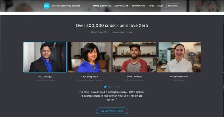
Online reviews are like word of mouth, with the only difference that these are displayed on a bigger platform and anyone can have access to them. About 84% of people trust online reviews as much as they would confide in personal recommendations. With that, it makes them a powerful tool to convert customer interest into sales.
Because other buyers had good experience with your service, the visitors coming to your site might get an insight into the product and working for other people like them. They start to trust your services.
Like Amazon, you can list each product and add a feedback section below for your customers. After a purchase has been processed, you can create pop-outs or emails (without annoying your customers) for instant feedback. Using that information, your visitors can take much less time to discover the product and your service.
7. Optimize For Mobile
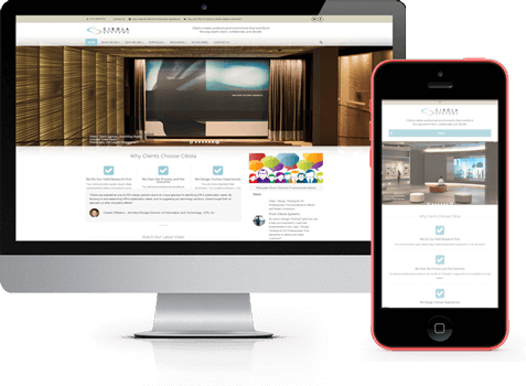
Hardly any business website is gaining better conversion without a mobile-friendly version. To date, about 50% of the website traffic comes from mobiles. And when it comes to mobiles, users abandon websites that take longer than 5 seconds to load. Any site with a mobile version will pick conversion higher than that of its desktop counterpart.
To create an optimized version, you need to reduce the design elements due to space limitedness. You can direct the user by merely adding essential images, short but readable text, and one-click buying options.
However, you must keep the phone-internet connectivity in view when optimizing your business site. Remove the clutter and simplify the interface, so conversion doesn’t seem hard.
Wrapping Up
Not every website finds conversion easy, but with simple optimization practices, you can earn a big-ticket to attracting potential traffic. The ways mentioned above help you recognize the elements and patterns which help you convert more and bounce less.
If you need help, check out Invictus Studio for their reliable and expert services for web design and development. We hope you find your preferred optimized web design with a matching conversion rate.
 Hi Boox Popular Magazine 2024


