 Hi Boox Popular Magazine 2024

Data visualization tools have unlimited purposes. These tools can help bring a spreadsheet to life, help users optimize sales territories, finalize data visualization projects, and more. As online maps have become increasingly popular, carefully considering the many different data visualization platforms are essential for business growth and development.
Regarding the best products, there are a few things users should consider. Ideally, always consider the software’s features, advantages or disadvantages, and monthly pricing they may have.
To help you get started, here are six online data visualization tools.
1. Tableau
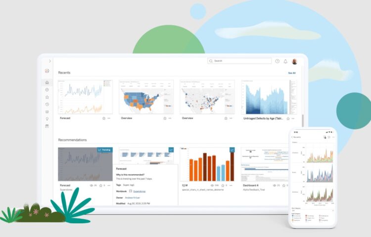
Tableau brings data visualization software that is famously user-friendly, bringing accessibility to many businesses. This software is a visual analytics platform that works to compile data from many different sectors. These sectors include artificial intelligence, machine learning, and business intelligence. As Tableau seamlessly integrates with Salesforce, any company utilizing CRM will largely benefit from this tool. That’s just one of approximately 250 applications businesses can use this tool.
While this software does contain an initial cost, there is a Tableau Public tool, which connects businesses on a budget with free interactive data visualization online.
2. Maptive
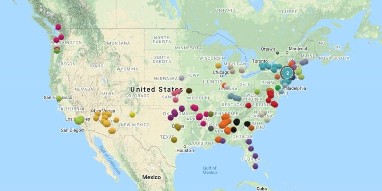
For businesses that collect large amounts of location data, bringing the information forward on an interactive map is the most straightforward analysis method. Maptive helps connect companies wanting further insight and understanding into their company with sophisticated software that automatically generates interactive maps. This software not only allows the automatic uploading of information from a variety of sources but multiple tools and features as well.
Users can develop comprehensive heat maps, drive-time radii, and cluster maps to showcase essential insights. For those wanting to maximize their sales or logistics teams, consider using the route optimization function within the program. As visual aids, all maps are entirely customizable and printable (up to poster size).
As Maptive is entirely cloud-based, collaboration, uploading, and sharing maps with other team members is effortless.
3. Google Charts
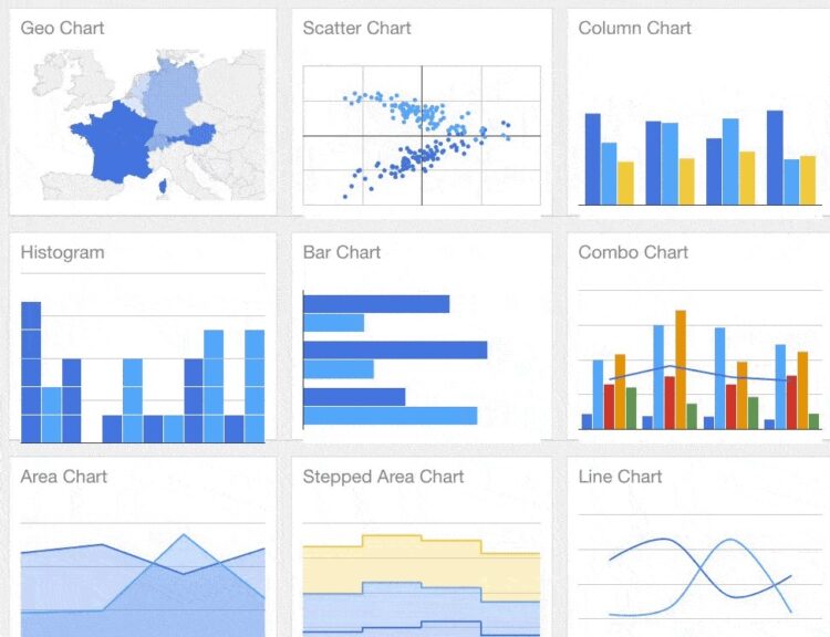
For companies requiring simple data visualization, Google Charts is a cost-effective solution. This software is completely free to use, converting your data into a wide array of pie charts and graphs. Google Charts offers real-time updates, along with cloud-based integration. Multiple members can access the software simultaneously. Finally, Google Charts is compatible with many desktop browsers and mobile devices.
4. Microsoft Power BI
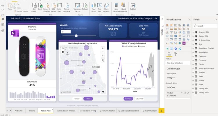
Microsoft BI is a comprehensive analytics and data visualization tool that lets users pull information from multiple data sources and automatically integrate it into interactive dashboards. This program is ideal for any business needing to create real-time reports for their KPIs and metrics.
Microsoft BI is a fabulous tool for converting complex information into a simplified infographic and chart. It’s also helpful for companies collecting large amounts of data from multiple sources. These tools make amalgamating everything simple. As this product is cloud-based, team members can access and share the data across many different Microsoft Office applications.
5. Sisense
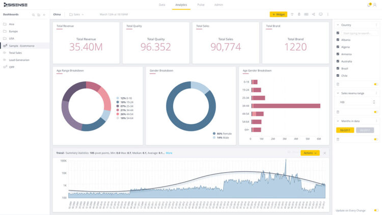
This software allows businesses to customize their data visualization and embed the final product virtually anywhere. Sisense will analyze your information and help users represent the information more interactively and visually. It will also simultaneously give everyone a chance to participate in data exploration. Sisense holds an open cloud platform, allowing users to gather information from various sources and making data accessible to an extensive range of tools more accessible.
Sisense also integrates with many other Sisense products. Users can export their interactive visualizations using several formats, including PPT, PDF, Word, Excel, and more if they want to share their interactive visualizations.
6. DOMO
For companies that want to use an open-source tool for their data analytics and visualization, DOMO could be the solution you’ve been searching for. This software helps business owners connect to any database and connects you with your information in a unified view. Domo updates analytics in real-time, embedding features that allow users to share their findings with team members, superiors, and customers.
There are countless options for customizing your reports. Users can adjust images, colors, texts, and more, allowing complete control over the final project.
Conclusion
When you want your business to succeed, it’s imperative to understand your company’s data. More companies are committing to data analysis tools with extensive incorporation of data solutions within the last decade. These tools can help you drive business decisions while feeling in total control.