 Hi Boox Popular Magazine 2024

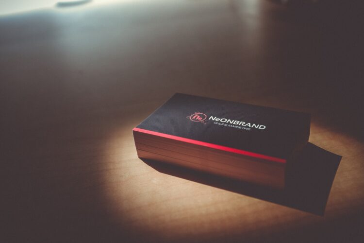
The key to a successful business card is to create something appealing, targeted, and informative. If you can make it eye-catching, imaginative, and highly unique as well, then you really are onto a winner. Here is a guide by 123Print.co.uk on how to ace your business card.
Create the right impression
First impressions count and always will, do your business card look professional and convey the right image about you and your business? Careful choice of graphic design concepts and printing choices are fundamental to achieving the right look.
Colour and images
- Use colour for interest and emphasis so be targeted, don’t overload the colour for the sake of it. Colour can also be used for text or background elements. Try and stick with three or four colours, no more
- Match colour tones, if you employ bright colours in your image or logo, then use black for the lettering or other bright colours that work with them; otherwise, the card can look confused and will be difficult to read. If your colours are muted, and pastel then stick to that scheme with other colours that you introduce for background or text lettering
- Include a photo, but only if it’s relevant and a great picture. Photos are really useful in service type businesses where you are likely to create a one on one relationship with your clients
- Try and avoid using clip art; it’s just second rate, good images are pretty accessible and affordable online or ask a designer to custom make you a logo if you don’t already have one. You want your business card to be memorable for all the right reasons
- Typesetting is something that might not jump out at you, but it is important. Stick with the classic left-aligned text as it is easiest to read – too much-centred text can look untidy, cluttered and is not that easy to read
- Stick to just one or two font types on the card otherwise. It will appear messy and disjointed
- Pick easy to read fonts rather than italicised or calligraphy style lettering unless that is the nature of your business. Try and avoid generic fonts but also make sure the information is readily discernible and doesn’t get lost with an impenetrable text against bright colours
- Keep the text font large enough to read even if it means you can’t include all the wording that you would like to
- Don’t use colours on either the background or as your text choice which makes the contact information difficult to see, for example, dark pink lettering on a red background. This never creates a good impression
Composition and format

This is the make or break of business card design, so if you don’t have an eye for styling, then employ a designer to do it for you, they can create several different alternatives for you to choose from.
- Avoid visual overload and clutter. If you need more room, use the blank space on the back of the card or create a folded business card, which will double the room. This is a great location for directions to your premises or a map or appointment times and availability
- Match the style and tone of the card to your business, don’t use something funky and on-trend if you are a Solicitor as people will be expecting a traditional and conservative card. However, if you just opened a new juice bar, you can go to town on bright colours and create a splash that sits well with your new business
- Think about the contrast and balance of your card. Dark against the light, the use of opposite colours and large images juxtaposed with smaller ones creates a balanced contrast, which is easy on the eye and will attract attention for all the right reasons. Keep a visual balance to all of the elements on the card – it’s easy to get lost in the detail and not see the wood for the trees
- Use ‘bleeds’ to extend coloured backgrounds or images to look like they are bleeding off the edge of the card; this creates a more professional look than an end line with a white edge
- Keep your logo and text away from the edges and use borders and thin lines with discretion as if they are too close to the edge, then any slight variation in cutting could create a lopsided or uneven finish
- Don’t be tempted to stray outside the conventional size, which is 3.5 inches by 2 inches, if you need more room then use the back of the card or consider the option of a folded card. The standard-sized card will fit into pockets and wallets, and if you opt for an oversized look, then you run the risk of the card being discarded simply because there is nowhere to put it. Rounded corners or a technique called die-cutting can add a professional and stylish finish without altering the size
Texture

It’s a real mistake to use cheap, thin paper in order to save costs. Opt for 12-14 pt thickness for the best impact and also durability. Think about the final coating you may want to add – select a gloss finish to make photos stand out and look beautiful, a dull or matte finish for non-shiny card printing, and this also makes the back easier to write on. Uncoated paper has a more textured feel that is more opulent and formal and could be an important theme to your stationery suite or you might want to choose foil stamping, embossing, or raised lettering to add that extra touch of class.
Contact information
Check again for any errors or typos before you sign off the design. Include only relevant contact details, so not every conceivable mode of communication as this will make the card too cluttered. Pick your busiest communication line, probably email or mobile – if you want to announce that you are also available on Twitter and Facebook, you can just add the icons that take up little room.