 Hi Boox Popular Magazine 2024

The entire business world has experienced a massive change in the last 10 years. In today’s world, it is impossible to survive on the market without digitalization. You do not have to be an e-commerce business to have an effective website. Your website is your ID in the online world, and it helps you boost your reputation and sales.
Logically, there are multiple factors that will influence your success in the online world. The number of conversions there (leads to buyers) depends on the content, web design, web functionality, and the quality of your products. Additionally, the way your customer support functions matters as well.
In this article, we will focus only on the design of your website. We would like to share a few web design tips for creating an effective website. Ready to find them out? If the answer is “yes”, then continue reading!
1. Start with an Idea and Plan

Everything starts with an idea and your ability to turn it into reality. However, if you want to turn your ideas into reality, then you need to have an appropriate plan.
For starters, you need to determine what exactly you want to achieve with your website. You need to turn your goals into numbers. For instance, this month, you want to get 200 new subscribers to your newsletter. On the other hand, the month after that, you want to increase your sales by 200%.
All these plans will actually encourage you to think of a web design idea that will help you reach your goals. You will easily determine which parts of the websites are more important, which elements each page needs to contain, etc.
2. Don’t Experiment Too Much
Redesigning your website from time to time is actually a good thing. It will break the monotony and people will appreciate your effort to make them feel comfortable. However, redesigning and experimenting with things are not the same.
If you are starting a website for the first time, we have one easy-to-understand tip – keep it simple.
Do not add a bunch of irrelevant elements to your pages, and do not make the so-called “rainbow website”. More precisely, a big number of colors in one place can’t ever be eye-pleasing.
You can easily notice by exploring the online world that most websites have simple designs. Most of them have white backgrounds with black letters. Of course, no one says white color is the only option you have. Use every other one, but ensure that they are somehow connected with the core values and industry of your business.
Let’s say that you run a private hospital. Would brown or black color be appropriate for a web design? Green can be a good choice as it reminds people of health. In the same way, find the colors that are matchable!
3. Add Social Proof Somewhere at Homepage
When you buy something online, what is the first thing you do after finding a perfect product?
Logically, you would want to find out more about the product and you will start looking for social proof. It is an additional confirmation that your decision is good.
Many web designers often forget to make enough space on their homepage for social proof. The social proof can come in form of basic reviews with stars and graders, textual testimonials, videos of previous customers, etc.
It is recommendable that part with social proof is colored a bit differently from other parts of the page. In that way, they will become more noticeable.
4. Replace Irrelevant elements with CTA
The call-to-action part needs to exist on almost every page of your website. For example, on the About Us page, it should be in the form “call us” or “contact us”. On the other hand, on your main page, it should be something like “buy”, “shop”, “visit”, etc.
Generally speaking, buttons always look more appropriate. However, have in mind that you must not respect the rules of “sales funnels”. You can’t convince on every page your buyers to purchase a product when they didn’t have the opportunity to check what you offer. Because of that, go step by step, and each page on your website should have CTA buttons similar to those we mentioned above.
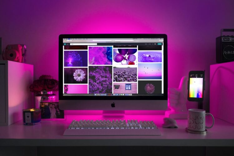
5. Photos Should Be Everywhere
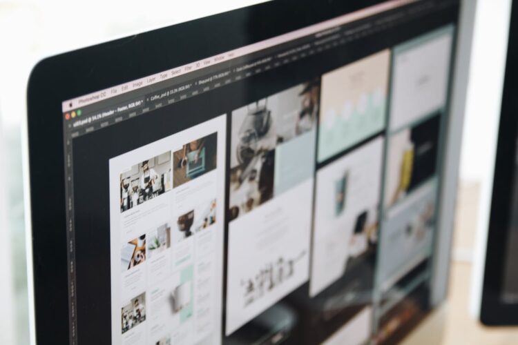
A lot of textual content in one place can make your website monotonous. That is the reason why photos should be the tool you use to break the monotony. The best possible option you have is to use your original photos. However, in case that is not possible for some reason, stock images can be a good alternative.
However, they will not be a decent opportunity always. Keep in mind that many other businesses are using them as well. Because of that, it is recommendable that you check out the websites of competitive companies. If you all use the same stock images, customers will consider you the same.
That is not going to make your website more effective than usual.
6. White Space Has to Exist
We are not talking here about the white color on your website. White space is also known as negative space and it refers to a space between all the elements that exist on your website. Imagine that the white space between videos, navigation, and text does not exist. Your website will not be eye-pleasing.
On the other hand, too much white space will convince the visitors that something is missing. More precisely, your website will somehow look poor. Because of that, find the best balance and ensure that all white spaces fit nicely.
Why is this important? It helps all the customers to focus on each part of the page. They won’t struggle to figure out where each section starts and ends.
7. Scrolling Over Clicking

In the end, we have to provide one effective piece of advice. People’s mentality and requirements have changed. It is much easier for your audience to research your website by scrolling than by clicking. There is no longer a need to represent your products on different pages. Doesn’t this seem like a good idea?
Final Thought
These tips are not that difficult to apply. However, if you struggle to improve your web design, it is not the end of the world. You can always hire web design professionals such as Rankbyfocus and let them finish this part of the job for you. That will save you time and potentially bring you more money. Until you find the appropriate web design, you will lose a lot of opportunities to convert leads into sales. Why would you expose yourself to such a risk?